
Main Menu Items
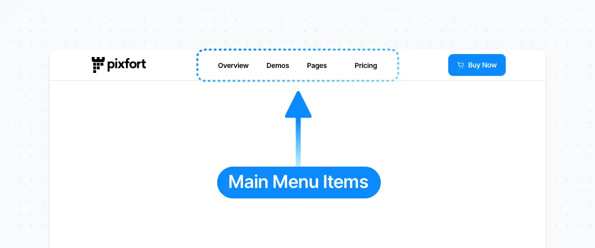
Main Menu Items [Desktop]

Main Menu Items [Tablet & Mobile]
The Main Menu Items share the same color of the text of the Header Area that contains the Menu element, and you can change the Text Color of each area from the Area Settings in the Header Builder (in Desktop and Tablet & Mobile versions). For example:

Header Area Settings [Desktop]
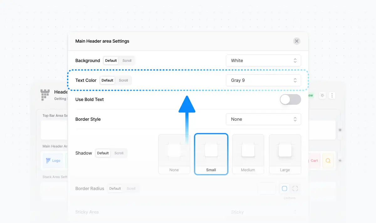
Example: Main Header Area Settings > Text Color
Menu Dropdown

Dropdown [Desktop]
Dropdown [Tablet & Mobile]
To change the colors of the Menu Dropdown (for text and background) on Desktop or Tablet & Mobile, open the Header Builder then click on the Menu Element. For example:

Theme Builder > Headers > Edit your Header > Click on the Menu Element

Dropdown Background and Text Colors
Note: the Light and Dark text colors are the theme default colors which are set in the Theme Options → Typography. For more information about the theme typography you can check the Theme Typography Article.
Custom CSS
Normal Dropdown Items
Otherwise, if you want to customize using CSS the dropdown Normal items text color you can use this code snippet into Theme Options > Layout > Advanced > Custom CSS:
.dropdown-item .pix-dropdown-title, .dropdown-item .pix-dropdown-title::after {
color: #eee !important;
}
*Note: you can change the color value depending on your needs.
And to customize the dropdown Normal items text hover color you can use the following code snippet into Theme Options > Layout > Advanced > Custom CSS:
.dropdown-item:hover .pix-dropdown-title, .dropdown-item:hover .pix-dropdown-title::after, .dropdown-item:focus .pix-dropdown-title, .dropdown-item:focus .pix-dropdown-title::after, .dropdown-item:active .pix-dropdown-title, .dropdown-item:active .pix-dropdown-title::after {
color: #333 !important;
}
*Note: you can change the color value depending on your needs.
Dropdown Heading Items
If you want to customize the dropdown Heading items text color you can use this code snippet into Theme Options > Layout > Advanced > Custom CSS:
.mega-col-title {
color: #888 !important;
}
*Note: you can change the color value depending on your needs.
And to customize the dropdown Heading items text hover color you can use the following code snippet into Theme Options > Layout > Advanced > Custom CSS:
.mega-col-title:hover {
color: #333 !important;
}
*Note: you can change the color value depending on your needs.
Dropdown Items Hover Background
The dropdown items hover background color is a default color based on the dropdown text color option (Light/Dark) selected in the menu options in the header builder. However, if you’re looking to customize the dropdown items background hover you can add this code snippet into Theme Options > Layout > Advanced > Custom CSS:
.dropdown-item:hover, .dropdown-item:focus, .dropdown-item:active {
background-color: rgba(100,150,255,0.1);
}
*You can change the background-color value depending on your needs.
Menu and Dropdown Icons
The color of menu and dropdown icons are the same as the text of menu and dropdown items. However, if you want to customize the color of all menu and dropdown Icons you can use this code snippet into Theme Options > Layout > Advanced > Custom CSS:
.navbar-nav .pix-dropdown-title svg {
    color: #1274E7 !important;
}
*Note: you can change the color value depending on your needs.
Dropdown Icons Only
The color of the dropdown icons are the same as the text of dropdown items. However, if you want to customize the color of all dropdown Icons you can use this code snippet into Theme Options > Layout > Advanced > Custom CSS:
.navbar-nav .dropdown-menu svg {
    color: #1274E7 !important;
}
*Note: you can change the color value depending on your needs.
If you’re looking to use the Primary Gradient color for the icons, you can use this code snippet into Theme Options > Layout > Advanced > Custom CSS:
.navbar-nav .dropdown-menu i, .navbar-nav .dropdown-menu svg {
    --pf-icon-color: url(#svg-gradient-primary) !important;
}