How to Access Popups
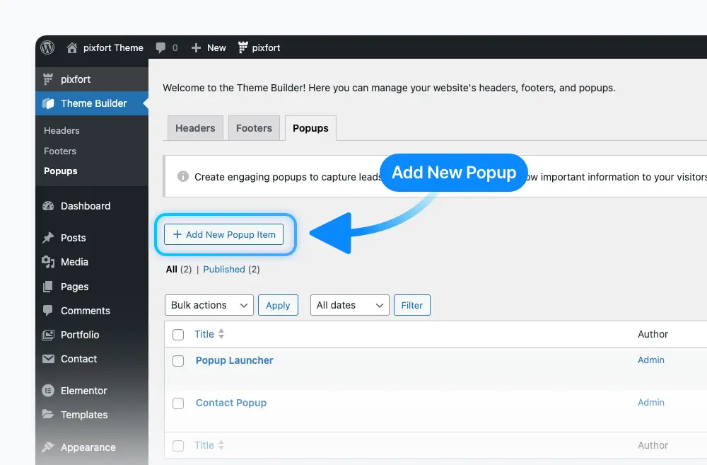
The popups are part of the Theme Builder. You can find the popups of your website from Theme Builder > Popups. For example:
Theme Builder > Popups
You can easily import one of the pre-made popups directly from your WordPress admin panel by navigating to pixfort > Demo Import > Popups. For example:
pixfort Theme > Demo Import > Popups
Add New Popup
To create a new popup, go to Theme Builder > Popups, then click on Add New Popup Item.
Give your popup a name and publish.
Theme Builder > Popups > Add New Popup Item
Customize Popup Options
Next, you’ll see the pixfort Popup Options, where you can control settings such as Display Conditions, Popup Design, Popup Triggers, Popup Launcher, and more.
For more information about pixfort Popup Options, you can jump to this section.
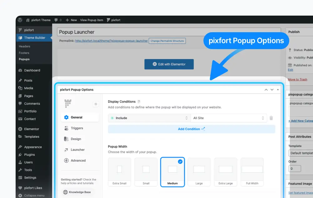
Popups > Edit Your Popup > pixfort Popup Options
Add and Edit Content with Elementor
To add and edit the content of your popup, click the Edit with Elementor button to open the Elementor Page Builder.
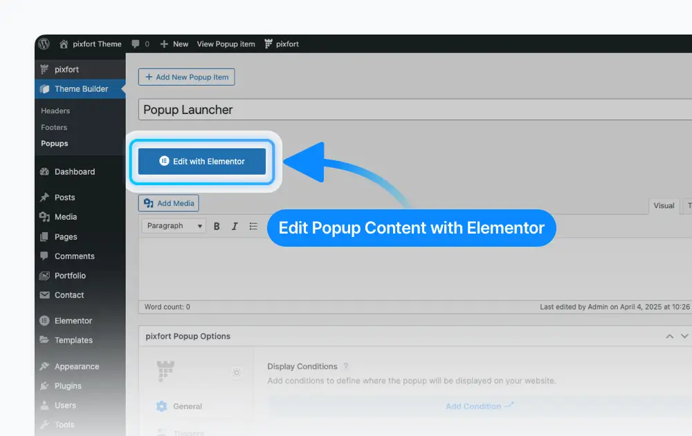
Popups > Edit Your Popup > Edit with Elementor
After creating a new popup, you can start editing it using the Elementor Page Builder. You can add any element you want from the Elements Library, just like you would when building regular pages.

Popup > Edit with Elementor
Good to know
You can set a background color for your popup from:
pixfort Popup Options > Design Tab > Background Color.
To link a popup to a button in your page, open the Button Settings in Elementor page builder, then choose the popup you want from the “Open Popup Instead of Link” option. For example:
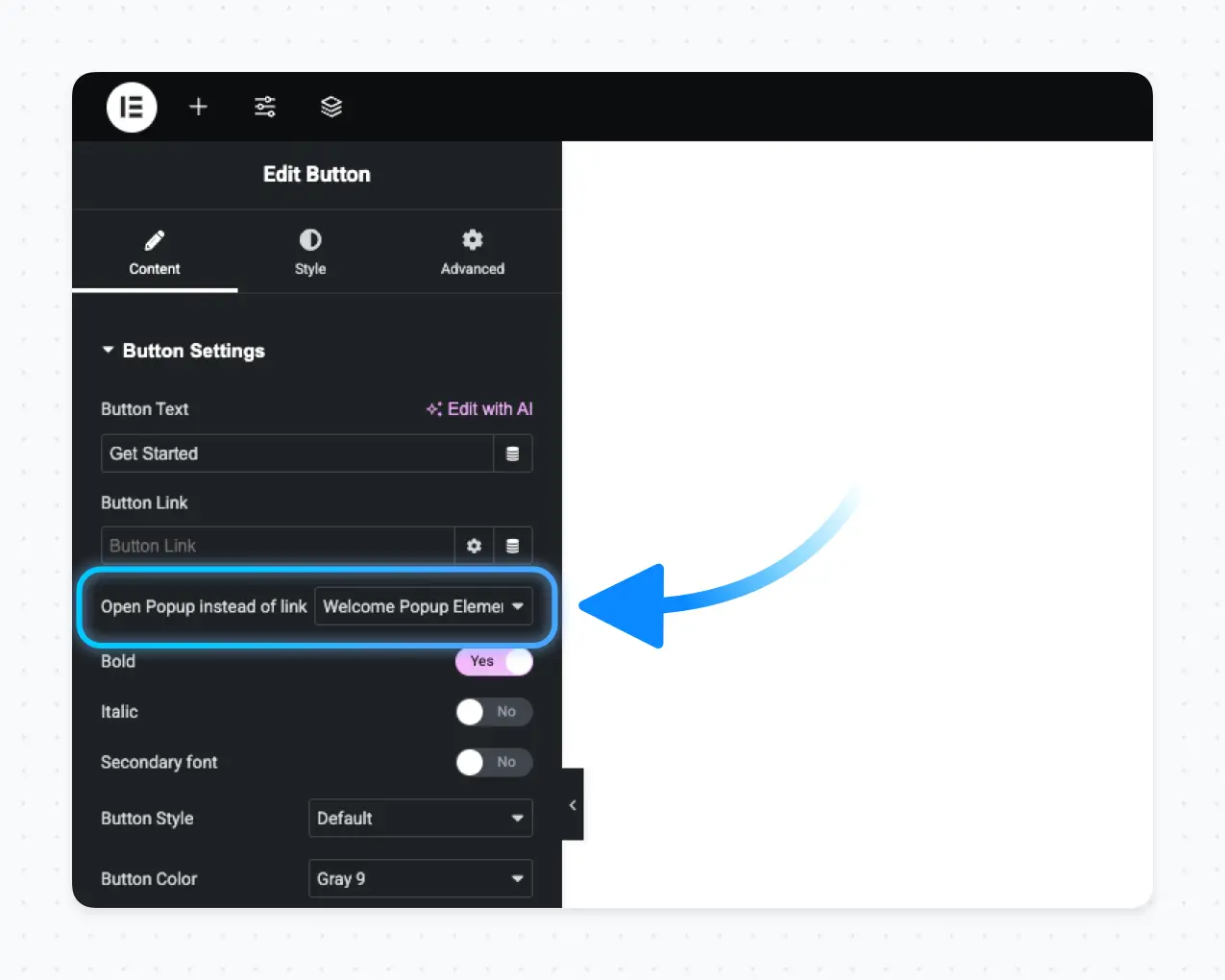
Elementor > Button Settings > Open a Popup Instead of a Link
You can also link a popup to a button in the Header. To do this, click on the Button Element in the Header Builder, open its settings, and select the popup you want from the “Open a Popup Instead of a Link” option. For example:
Header Builder > Button Element > Open a Popup Instead of a Link
Important
Make sure you’ve already created popups on your website — otherwise, no popups will appear in the selection list.
To open a popup from any link on your website, go to Theme Builder > Popups and copy the Popup Link.

Theme Builder > Popups
You can also copy the popup link from the pixfort Popup Options > Triggers > Open from Link:

Popup Edit Page > pixfort Popup Options > Triggers > Open from Link
Once you’ve copied the link, you can use it with any clickable element on your site — such as in a Feature element, Clients element, Simple Links, and more.
To close the popup using a custom button inside it, first add a Button element inside the popup. Then, in the Button Settings > Advanced in Elementor, add the class pix-close-popup in the CSS Classes field, and set the button link to #.
The pixfort Popup Options panel allows you to control various popup settings such as Display Conditions, Popup Design, Popup Triggers, Popup Launcher, and more.
You can find the pixfort Popup Options in the Popup Edit page. For example:
Popups > Edit Your Popup > pixfort Popup Options
Useful Tips
Responsive Values
Help Tooltips
Below you can check the main options available in pixfort Popup Options:
In the General tab, you’ll find:
- Display Conditions – Choose where you want the popup to appear.
- Popup Width – Set the width of the popup container.
- Popup Height – Set the height of the popup container.
pixfort Popup Options > General Tab
In the Triggers tab, you can find the following popup triggers:
- Show Popup on Page Load – Displays the popup automatically after the page finishes loading.
- Show Popup on Page Exit – Displays the popup when the user’s cursor exits the browser window.
- Show Popup on Scroll – Displays the popup when the user scrolls the page.
- Show Popup on Scroll to Element – Displays the popup when the user reaches a specific element on the page.
- Open from Link – Copy this popup link to trigger the popup from any link on your site.
pixfort Popup Options > Triggers Tab
Display Up to X Times – This option appears when you enable one of the popup triggers.
If enabled, you can set a Display Count, which determines how many times the popup will appear for each user. You’ll also have the option to reset the display count for all users whenever needed.

pixfort Popup Options > Triggers Tab > Display up to X times
The Design tab offers extensive customization options for popups, including positioning, styling, backdrop, and close button settings. You can control the popup’s appearance, entrance animation, backdrop color and blur effects, as well as the close button’s alignment, position, and icon. These features provide a highly customizable and polished popup experience.
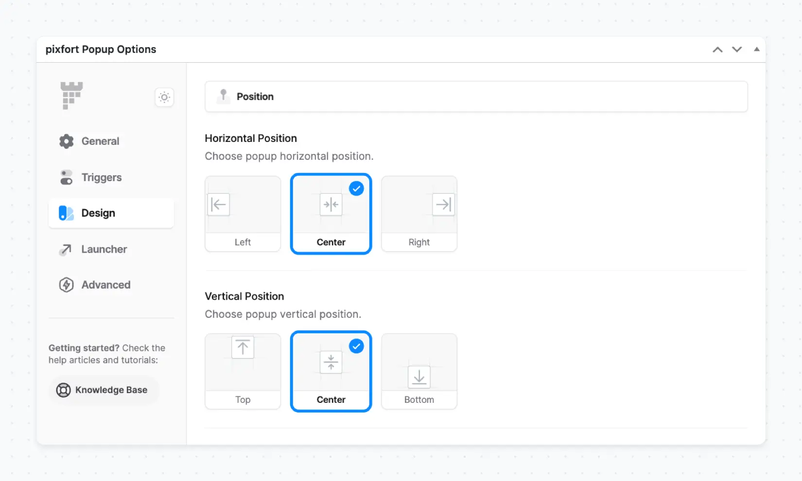
pixfort Popup Options > Design Tab
In the Launcher tab, if you enable the popup launcher, you’ll gain access to customization options for the launcher button — such as its Positioning, Style, and the Launcher logo.
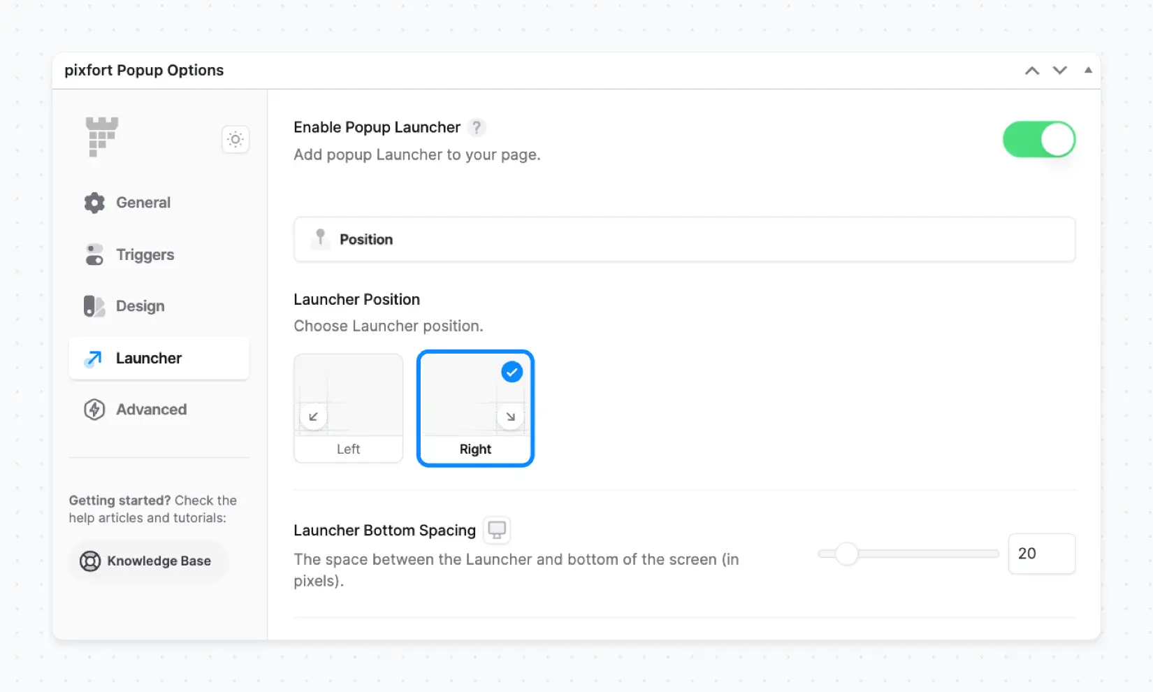
pixfort Popup Options > Launcher Tab
In the Advanced tab, you can find the following options:
- Display on Devices – Control which screen sizes (Desktop, Tablet, and Mobile) the popup triggers will apply to.
- Custom CSS – Add your own custom CSS code to style the popup with additional customization.

pixfort Popup Options > Advanced Tab
Pro Tip
If you’re looking to customize the popup via CSS, check the article below for useful CSS selectors and variables specific to pixfort popups: