The pixfort Theme includes a wide range of utility classes for advanced styling. Below, you’ll find a list of the most useful CSS classes organized by category.
Background Colors
All background color classes in the pixfort Theme start with the prefix bg- followed by the color name. For example: bg-green
Main Colors:
The theme’s primary gradient background
The primary color of the theme.
The secondary color of the theme.
Basic Colors:
Light Variant Colors:
Gray Shades:
Dynamic Gray Shades:
Dark & Light Opacity Colors:
Blurred Backgrounds:
bg-dark-blur
bg-light-blur
bg-dynamic-blur
Text Colors
All text color classes in the pixfort Theme start with the prefix text- followed by the color name. For example: text-green
Variable Text Colors:
text-body-default– For Body text colortext-heading-default– For Heading text colortext-primary– Primary text colortext-secondary– Secondary text color
Dynamic Text Colors:
text-dynamic-gray-300– For Dynamic Gray 300text-dynamic-gray-600– For Dynamic Gray 600- etc.
Static Text Colors:
text-whitetext-bluetext-greentext-cyantext-yellowtext-orangetext-redtext-browntext-purple
Text Sizes
Text size classes use the prefix text- followed by a size value or name.
Available Text Sizes:
text-24– 24pxtext-20– 20pxtext-18– 18pxtext-small– 14pxtext-extra-small– 12px
You can also define your own size in Theme Options > Layout > Advanced > Custom CSS.
For example:
.text-28 {
    font-size: 28px !important;
    line-height: 44px !important;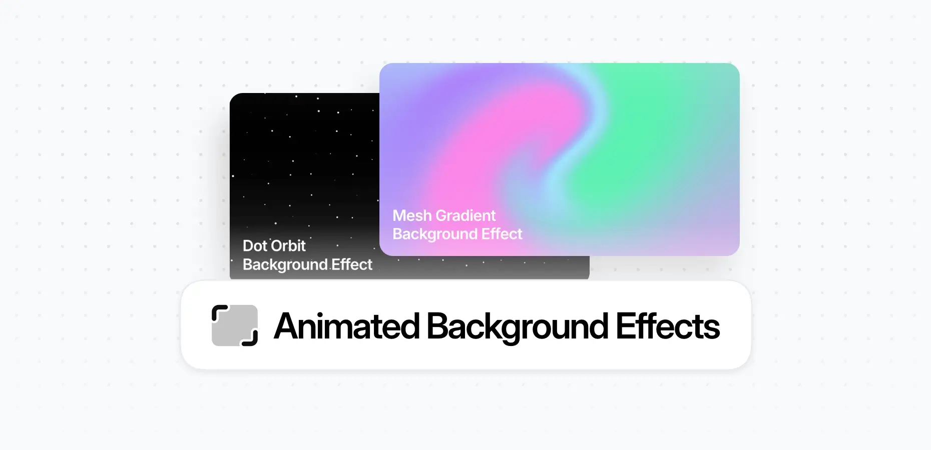
}Animations
Fly Small
fly-sm
Fly Medium
fly
Fly Large
fly-lg
Scale Small
scale-sm
Scale Medium
scale
Scale Large
scale-lg
Scale Inverse Small
scale-inverse-sm
Scale Inverse Medium
scale-inverse
Scale Inverse Large
scale-inverse-lg
Scale In Extra Small
pix-scale-in-xs
Scale In Small
pix-scale-in-sm
Scale In Normal
pix-scale-in
Scale In Large
pix-scale-in-lg
Rotating

pix-rotating
Inverse Rotating
pix-rotating-inverse
Fade
pix-fade
Bounce
Small
pix-bounce-sm
Medium
pix-bounce-md
Large
pix-bounce-lg
Scale
Small
pix-scale-sm
Medium
pix-scale-md
Large
pix-scale-lg
Control Animation Speed
Slow
pix-duration-slow
Medium
pix-duration-md
Fast
By default
Shadows
Shadow Small
shadow-sm
Shadow Medium
shadow
Shadow Large
shadow-lg
Inverse Shadow Small
shadow-inverse-sm
Inverse Shadow Medium
shadow-inverse
Inverse Shadow Large
shadow-inverse-lg
Hover Shadow Small
shadow-hover-sm
Hover Shadow Medium
shadow-hover
Hover Shadow Large
shadow-hover-lg
Inverse Hover Shadow Small
shadow-inverse-hover-sm
Inverse Hover Shadow Medium
shadow-inverse-hover
Inverse Hover Shadow Large
shadow-inverse-hover-lg
To remove a shadow, use: shadow-0
Spacing
You can apply responsive margin and padding with shorthand utility classes.
Notation:
Classes use the format: pix-{property}{side}-{size}
Example: pix-px-20 → 20px horizontal padding
Property:
m– Marginp– Padding
Side:
t– Topb– Bottoml– Leftr– Rightx– Left & Righty– Top & Bottom- (blank) – All sides
Size:
5,10,15,20,25,30,35,40,45,50,60,70,80,90,100,120,130,150,200
You can add more sizes by modifying the $spacings Sass map variable.