Dark Mode provides a visually elegant alternative to light themes, offering improved readability in low-light environments and a modern aesthetic for your website. The pixfort theme allows you to use both light and dark modes simultaneously, giving your visitors the ability to choose their preferred experience using the built-in theme switcher. This guide will walk you through how to enable and customize dark mode using the built-in features of the pixfort theme.
How to Enable Dark Mode
Dark mode can be enabled from Theme Options > Design System > Colors > Enable Dark Mode.

Theme Options > Design System > Colors > Enable Dark Mode
Once enabled, you can set the default mode for your website (e.g., Light or Dark). This default theme mode will be the one your visitors see when they first open your website. If you want to offer only dark mode, simply set the default theme mode option to “Dark” and avoid adding a Theme Switcher to your website.
Dynamic Color System Overview
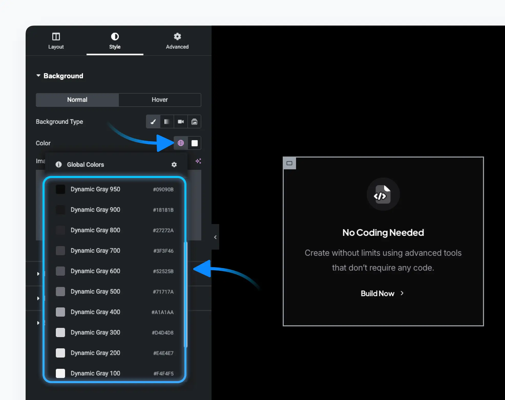
In addition to static colors, the theme includes a Dynamic Colors section (in Theme Options > Design System > Colors) tailored for both light and dark modes. These colors adapt automatically depending on the active theme mode.

Theme Options > Design System > Colors > Dynamic Colors
The available Dynamic colors include:
- Dynamic Heading
- Dynamic Background
- Dynamic Gray (ranging from 50 to 950)
- Dynamic Blur
You can also set Link Color in the Main Colors section to use dynamic values.
Other colors remain static.
Good to know
To add a new dynamic color, go to Design System > Colors > Custom Colors and create a color variable with your preferred name. For example:
Theme Options > Design System > Colors > Custom Colors
For a full explanation of the theme color system:
Check the Color System Article
Adapt Theme Options to Dark Mode
When dark mode is enabled, default dynamic color values are already set. You can adjust them under Design System > Colors in Theme Options.
Below are some essential steps to adapt your theme options to dark mode:
Logo Image
A toggle will appear under Settings > General > Logo allowing you to set different logos for Light and Dark modes. For example:
Theme Options > Settings > General > Logo
Background and Text Colors
Ensure the default Website Background Color (Theme Options > Settings > General) uses a dynamic color such as Dynamic Background.
In Theme Options > Typography > General, set:
- Body text color to something like
Dynamic Gray 600 - Heading color to
Dynamic Heading
Ensure the options (like background color, Intro Title Color, etc.) in the following tabs in the Theme Options also use dynamic colors:
- Pages
- Blog
- Shop
- Portfolio
Theme Mode Switcher
When dark mode is enabled in the Theme Options, a Theme Mode Switcher icon appears in the top-left toolbar in Elementor, allowing you to toggle between modes when building your pages. For example:
Elementor Page Builder > Theme Switcher
Dynamic Colors in Elementor
In Elementor, to adapt your page content with dark and light modes, you can choose from the dynamic colors in each pixfort Element settings. For example

Elementor Page Builder > pixfort Dynamic Colors
For other areas, dynamic colors are accessible in all areas that have Elementor’s default color picker — for example:
- Container background
- Border color
- Overlay color
- And more…
Elementor Page Builder > Default Global Colors
Dynamic Images in Elementor
Many of pixfort elements that include image options (e.g., Image element) allow you to upload separate images for Light and Dark modes (The Dark Image is optional, leave empty to use the Light Image). This feature is exclusive to pixfort Elements. For example:

Elementor Page Builder > pixfort Image Element
Header Customization for Dark Mode
Theme Switcher
To let your website users switch between light and dark themes, you can add a Theme Switcher element in the Header Builder. For example:

Header Builder > Add Theme Switcher Element
Header Content Customization
In the Header Builder, when the Dark mode is enabled on your website, you can:
- Use Dynamic Colors for header areas and elements.
- Override the default Light and Dark modes logo images with different images inside the Logo element (optional).
Good to know
When dark mode is enabled in the Theme Options, you can preview the header in light or dark mode directly within the Header Builder’s Preview mode by clicking the toggle labeled “Test Dark Mode”. For example:

Header Builder > Preview Mode > Test Dark Mode
Useful Tips
Understanding Default Dynamic Gray Values
The default dynamic gray scale is reversed in light vs. dark. This structure is the default configuration provided with the pixfort theme. For example:
Dynamic Gray 50 (dark mode) = Dynamic Gray 950 (light mode)
This means the values for light and dark are manually set in inverse order to provide visual balance. However, this is not automatic—you can freely customize the light and dark values of each dynamic gray color to suit your own style and preferences.
This reversal provides great flexibility for consistent tone and contrast.
Tinted Dark or Light Themes
You can customize the Dynamic Color Palette with custom shades (e.g., creamy whites or dark navy instead of pure black). Useful tools for color generation: https://uicolors.app
Best Practices
- Use Dynamic Colors where background and contrast may change.
- Use Static Colors for sections with fixed styling.
- Stick with the default dynamic color palette — it’s powerful and usually sufficient.
- Add custom dynamic colors only when needed.
- When using both light and dark modes, choose main colors that look good in both versions.
You can further customize your site with custom CSS. When dark mode is active, the body tag will contain a .pix-dark class.
Use this class to apply specific styles. Example:
.pix-dark .my-custom-element {
  background-color: #111;
  color: #eee;
}